

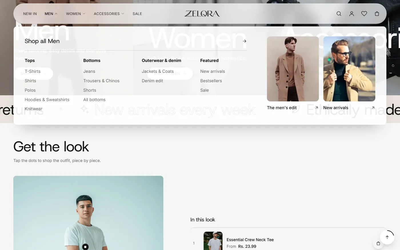
Mega menu with promo cards
Up to four link columns plus image cards, or a simple dropdown. Six header styles, with a different header on inner pages.
Zelora is a premium, mobile-first Shopify theme with 77 sections, six header styles, a mega menu, shoppable videos and stories, and complete typography control.
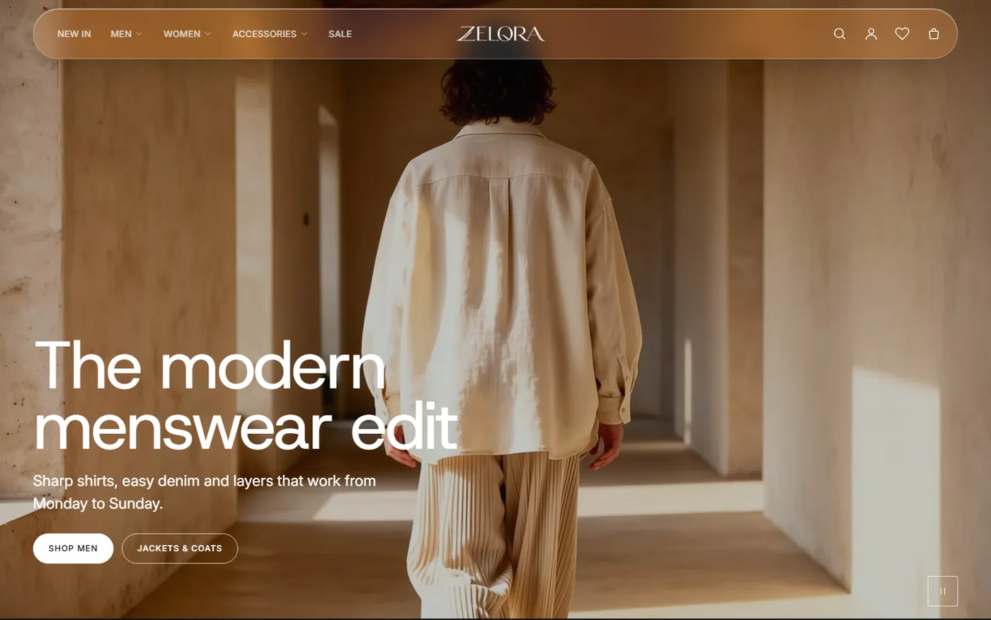
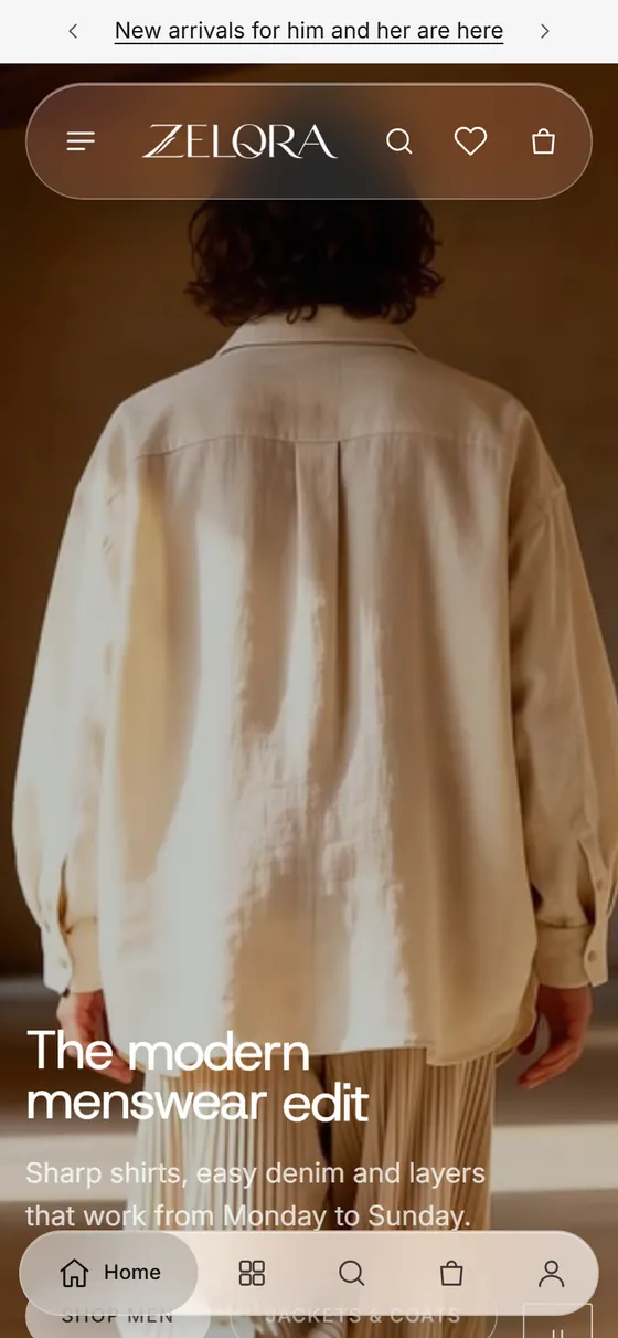
Real screens from the Zelora demo store.
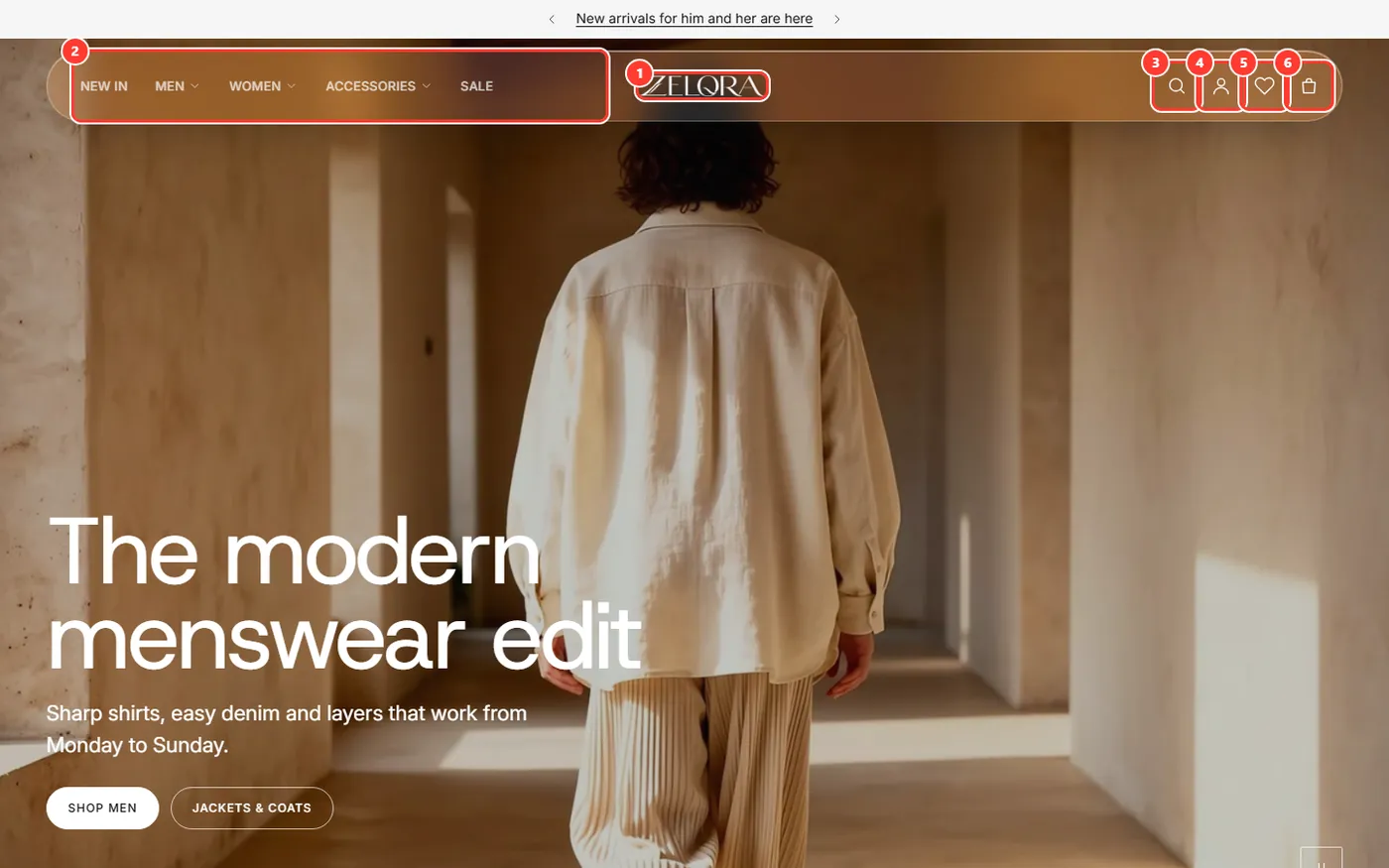
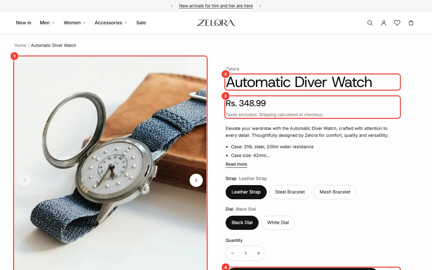
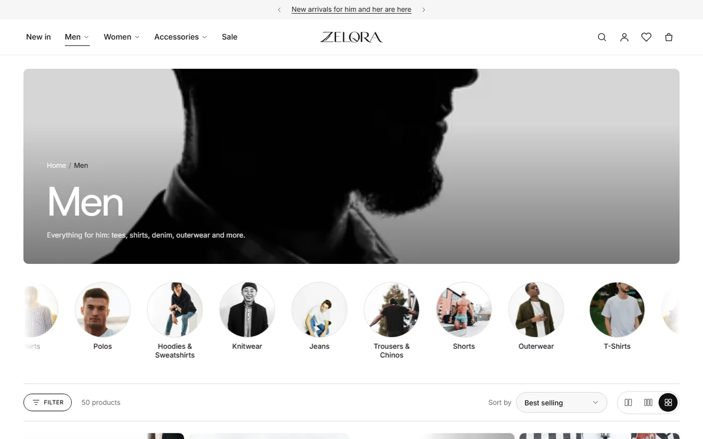
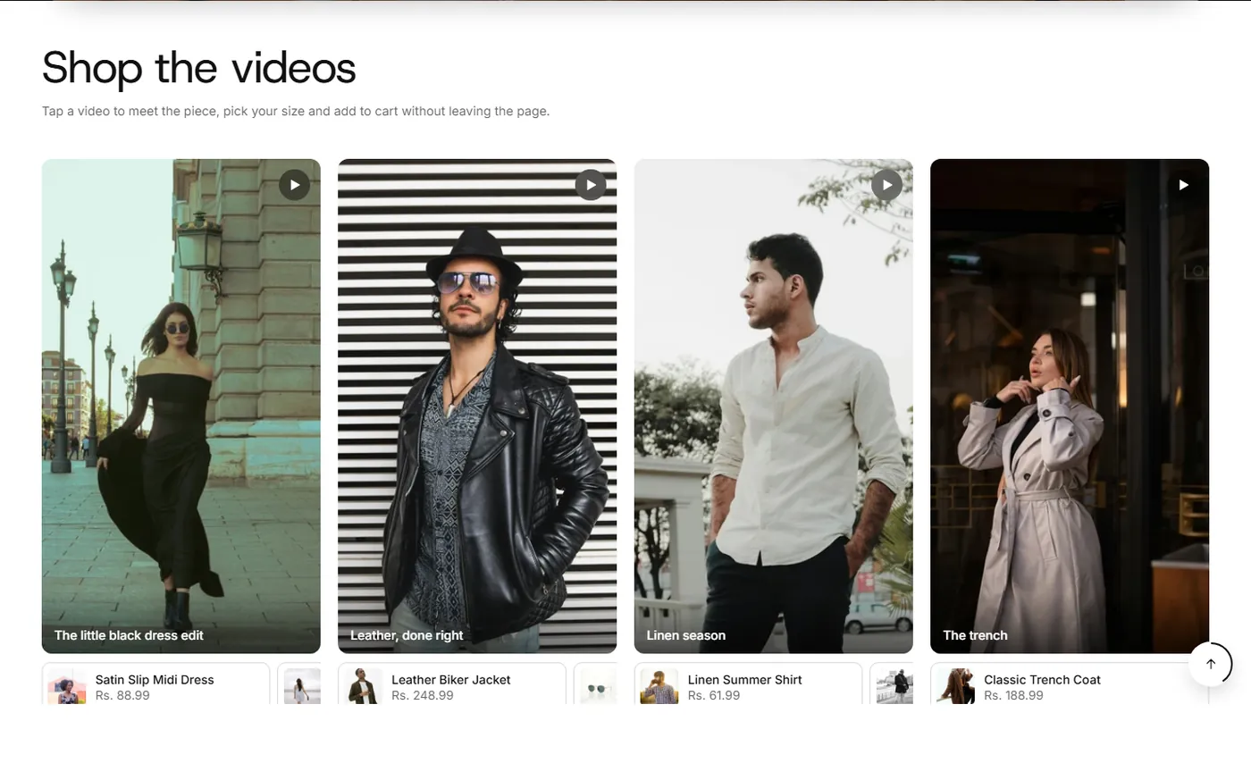
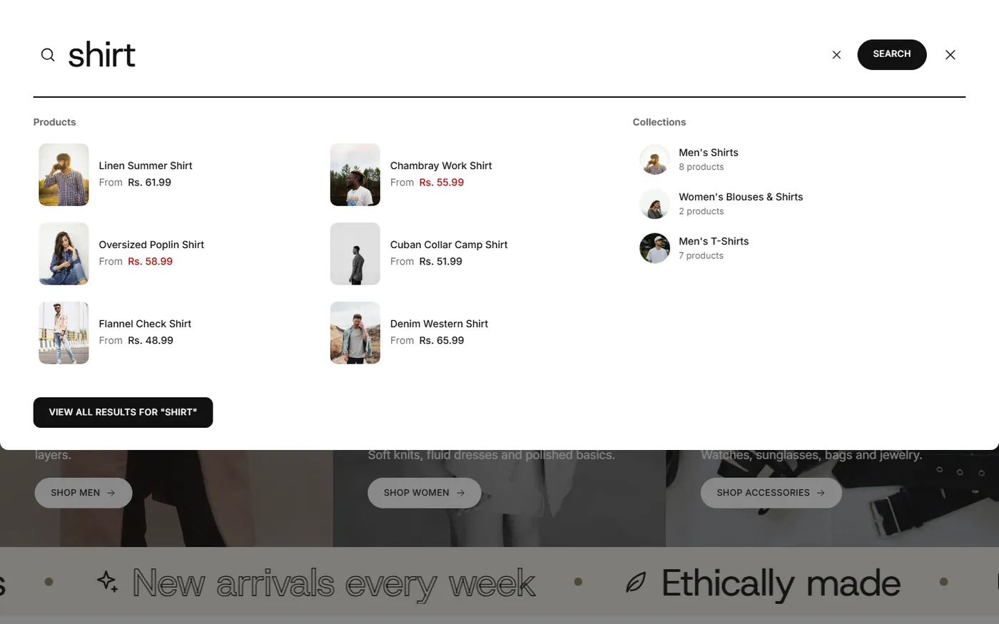
Online Store 2.0 from top to bottom: every page is built from sections and blocks you can rearrange in the theme editor.
Up to four link columns plus image cards, or a simple dropdown. Six header styles, with a different header on inner pages.
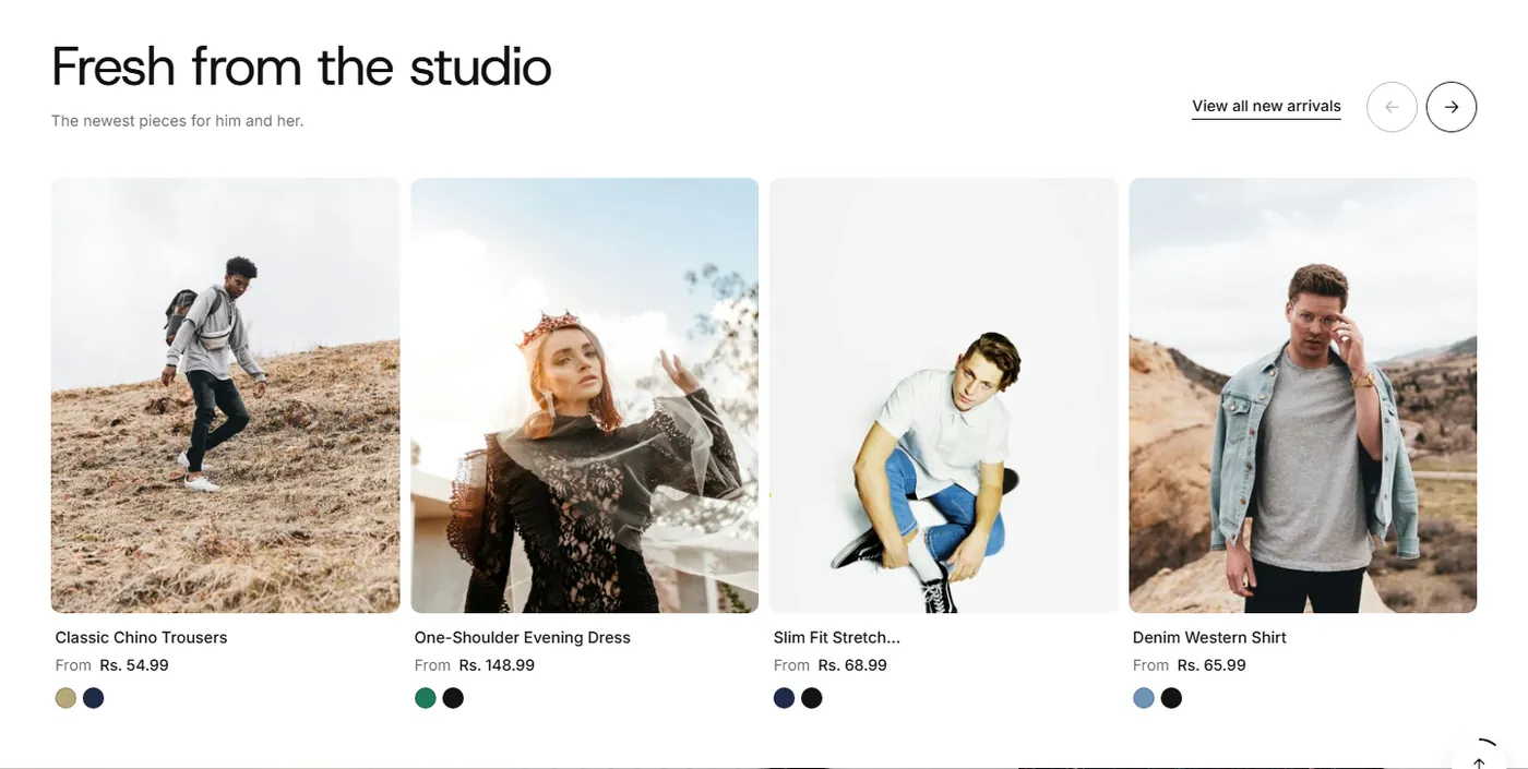
Swatches, badges, quick actions.
Live suggestions as you type.
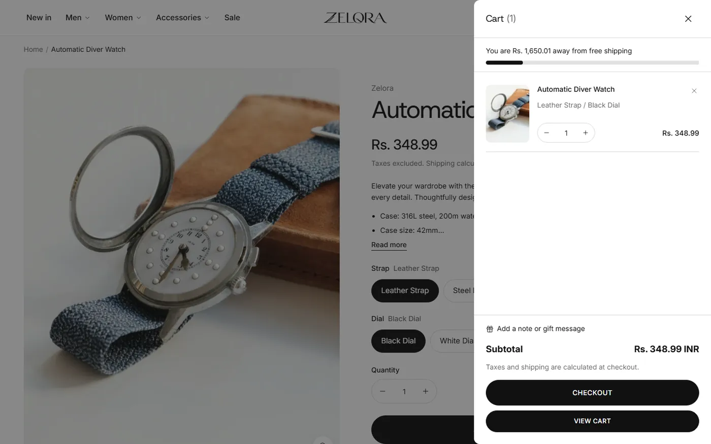
Free-shipping progress and express checkout.
Fonts, sizes for H1 to H6 on desktop and mobile, and a heading size in every section.
Swatches, badges, quick view, wishlist and add to cart. Change it once and every card follows.
Define light and dark schemes once, then choose one for every section.
Shoppers save products and preview them without leaving the page.
Story rings in any shape that open full-screen stories with tagged products.
Swipeable carousels, large tap targets and an optional app-style bottom bar.
Add apps to the product page, footer and most sections without touching code.
Skip link, keyboard support, visible focus and reduced-motion support.
Product, FAQ and article structured data, Open Graph tags and responsive images.
Twelve groups of global settings cover colors, typography, layout, buttons, shapes, product cards, cart, animation, social media, logo, search and custom code. Every section adds its own heading size, color scheme and spacing.
Build any page from the library. Every section has its own settings and works on desktop and mobile.

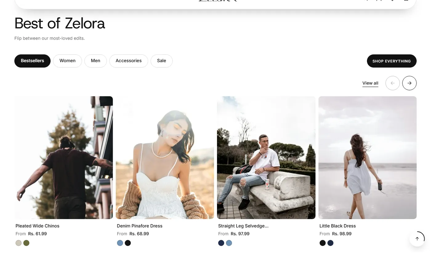
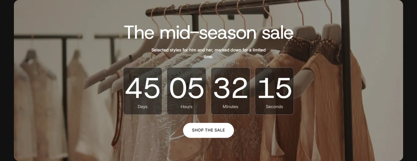
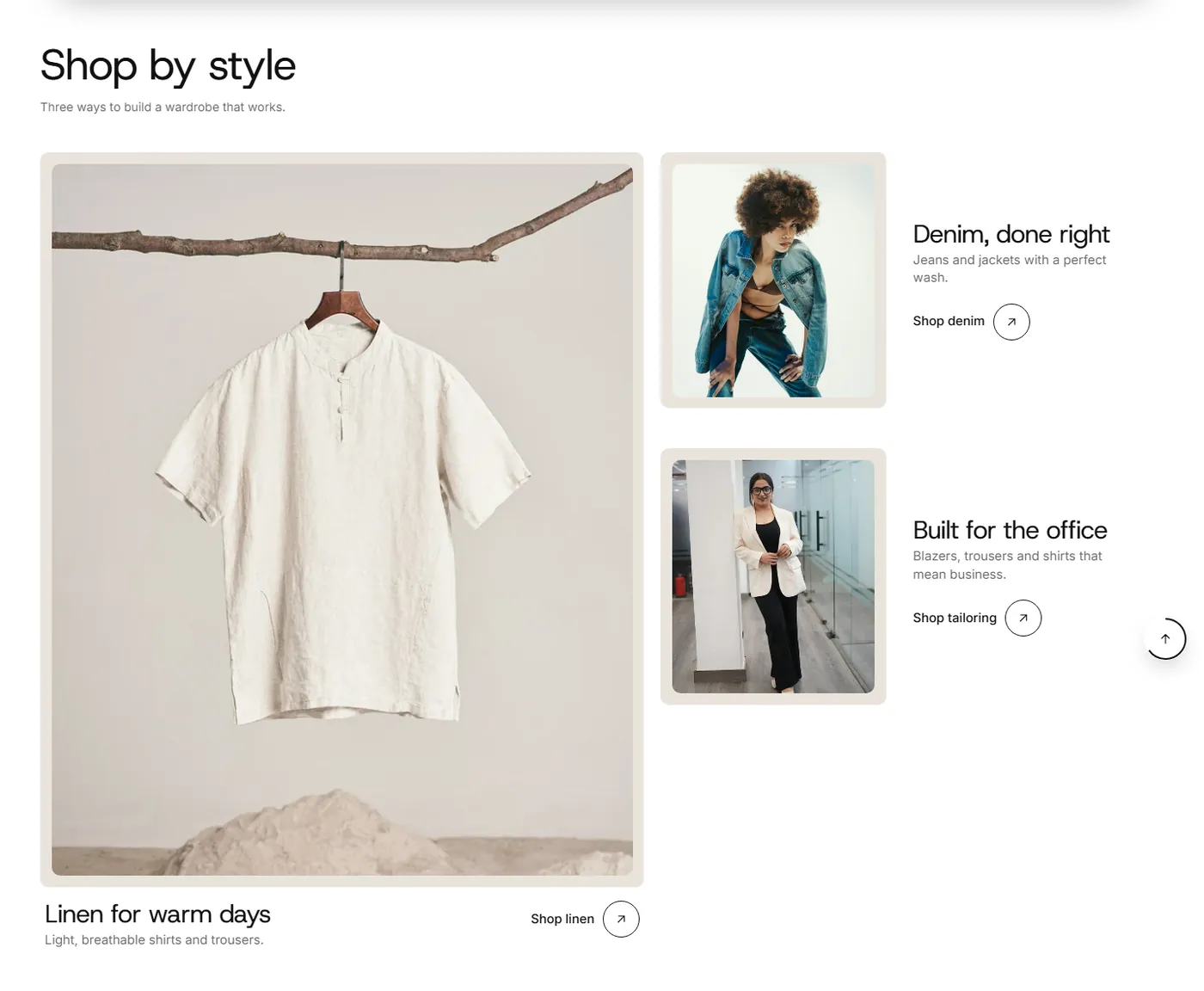
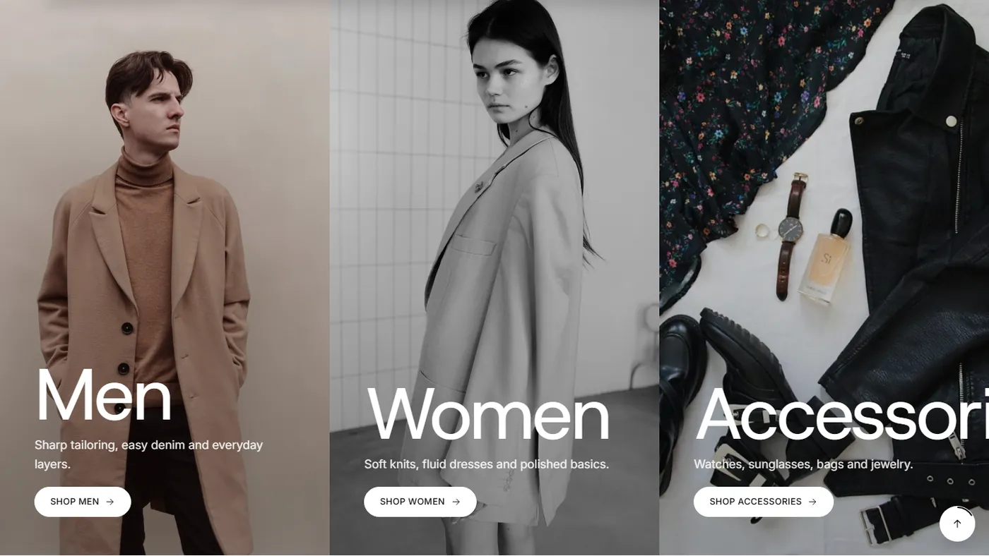
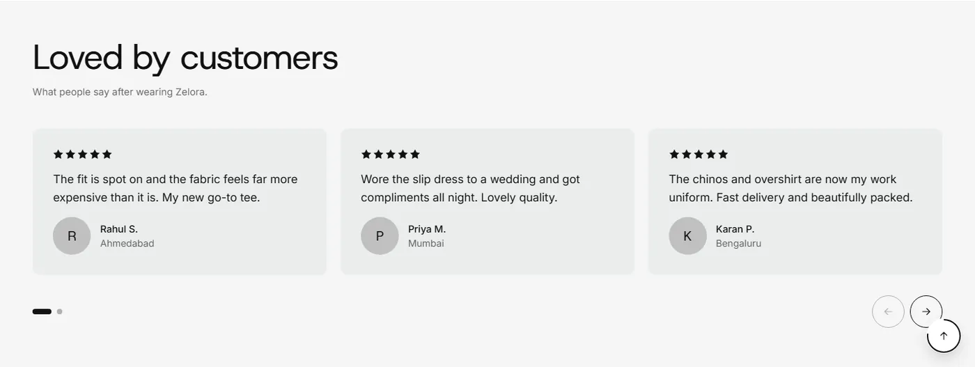
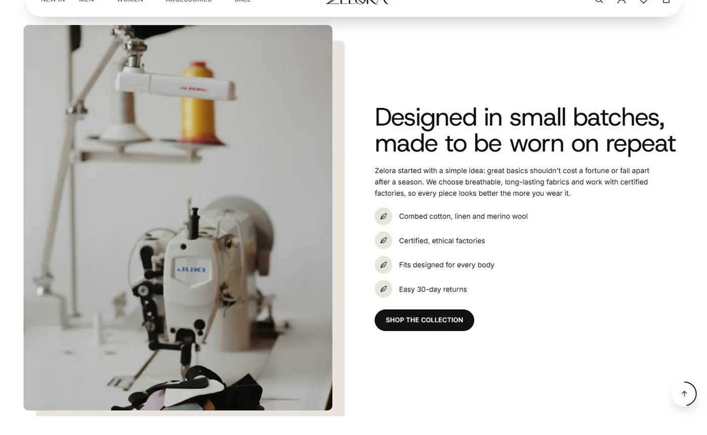
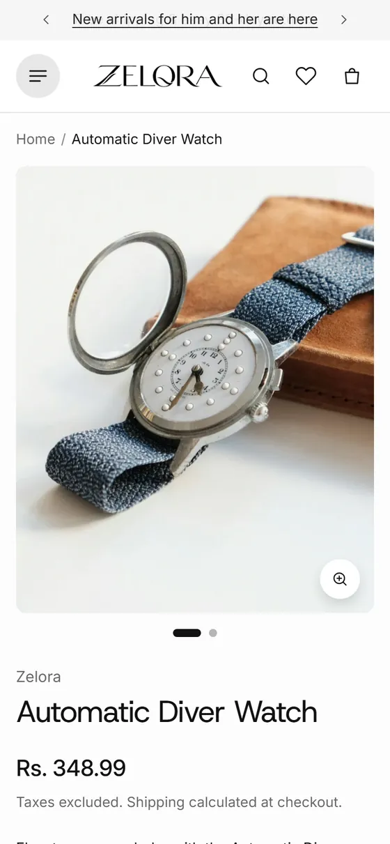
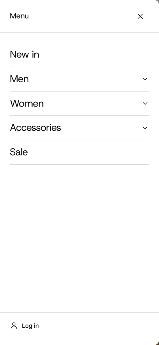
Most fashion shopping happens on a phone, so every section is designed there first.
Lighthouse scores on mobile, taken on the Zelora demo store collection page.
Scores vary by page and content. Pages with heavy video or many images will score lower.
Upload the theme zip in Online Store, Themes, then open the editor.
Add sections, choose fonts and color schemes, build your menus and pages.
Check the preview on a phone and publish. The documentation covers every setting.
Yes. Every page is built from sections and blocks, so you can add, remove and reorder content in the Shopify theme editor without code.
Yes. Turn on a different header for inner pages and give it its own style, layout, height, colors and sticky behaviour, while the home page keeps its floating pill.
Yes. Choose fonts from the Shopify font library for headings, sub-headings, paragraphs and buttons, and set desktop and mobile sizes for every heading from H1 to H6. Each section also has its own heading size.
Yes. App blocks are supported on the product page, the footer and most sections, so installed apps can be placed where you want them.
Filters use Shopify’s Search & Discovery app. Set them up once and they appear in a drawer or a sticky sidebar on collection pages.
The documentation covers every setting and section, and you can search it with Ctrl K. For anything else, contact us.
Ask about features, setup or customisation. Tell us what you need and we will get back to you.